In the realm of data visualization domain addition of animations, to your dashboards can greatly boost user interaction levels. Lets dive into the process of crafting bar charts, in Power BI that display shifting data points as you engage with the dashboard. This tutorial will guide you through every step starting from configuring your workspace to bringing in data and incorporating visuals.
Setting Up Your Power BI Dashboard
Lets get started by launching a Power BI file and beginning by changing the background color to a light shade of gray while making sure the transparency is set to zero to give your dashboard a sleek and polished appearance.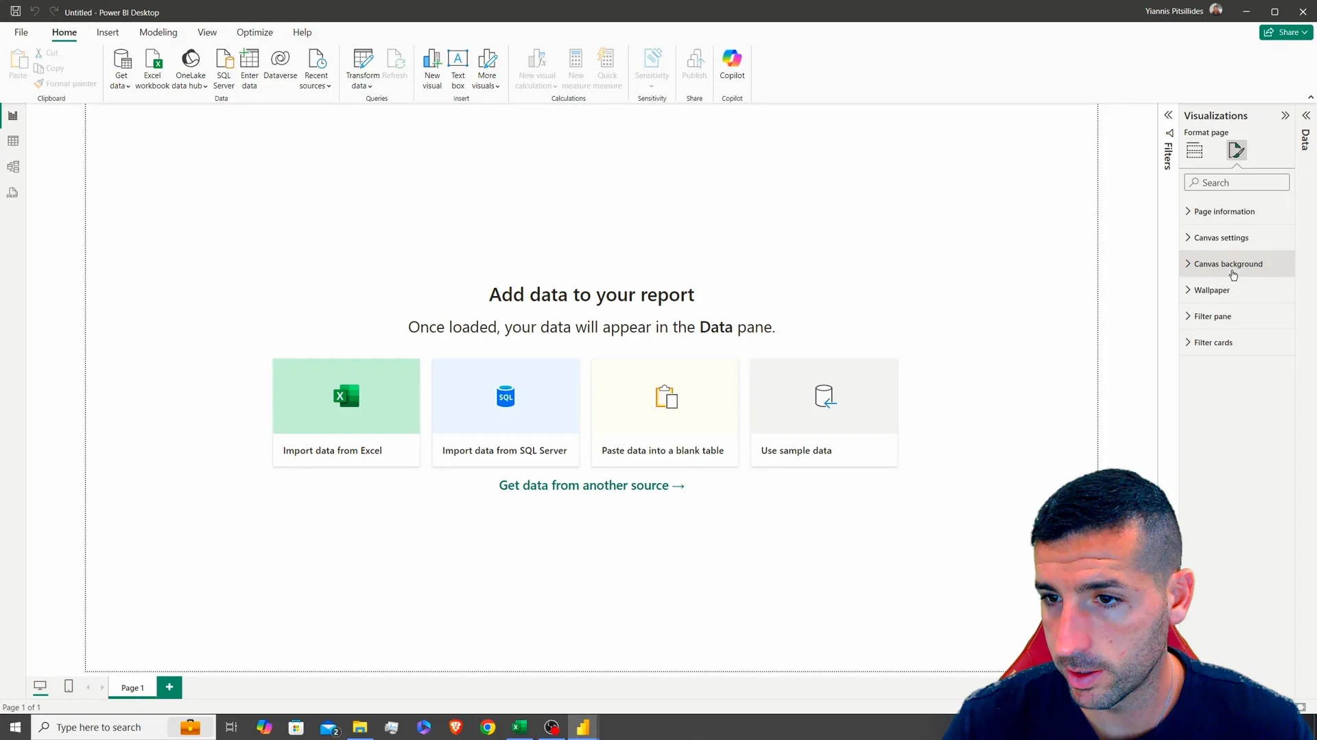
Adding a Title
Next step is to give your dashboard a title by selecting the text box option and entering “Animated Bar Chart.” Make sure to align the text in the center and adjust its size accordingly to match your design requirements; This title will act as an element, for your dashboard.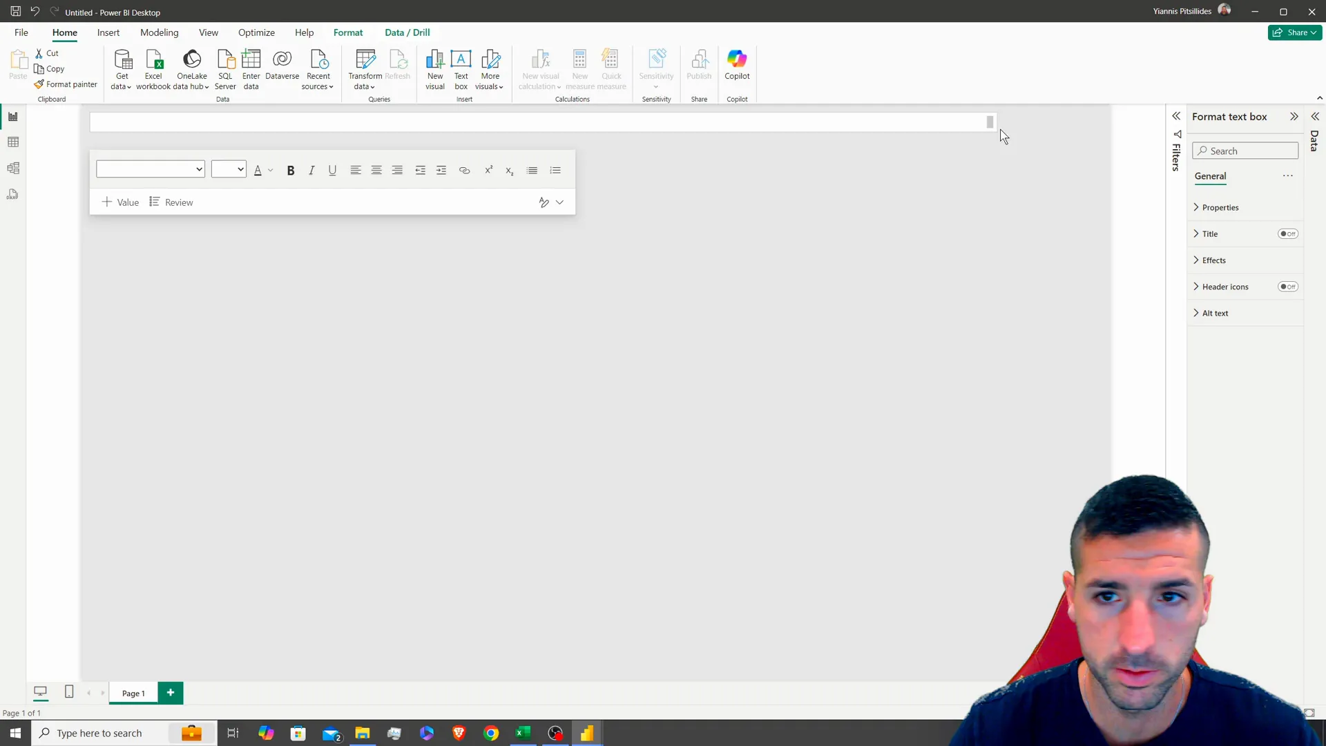
Incorporating Images
To make your dashboard more visually appealing try including some images! Usually put logos or pertinent visuals in the corners. In this case add two images to liven up the dashboards look.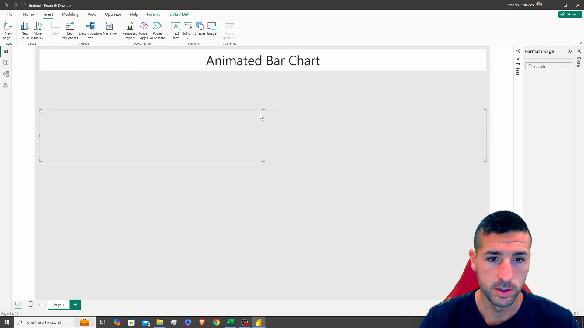
Loading Your Data
Alrighty then! Lets kick things off by getting the raw data loaded up first! Head on over to the Home tab. Click on “Excel Workbook.” From there you can select your data source. In this scenario we’re looking at some golf related info ! Once the data is all loaded up nice and neat for you to see on your screen. Keep an eye out for fields, like season details player names and how wins they’ve racked up.
Understanding Your Data
Before we move forward with this process it’s crucial to grasp that this data adds up over time.The steps to transform data into figures using Python can be provided upon request, in the comments section for a separate tutorial specifically, on this topic!
Creating Animated Visuals
Power BI does not have built in support, for animated visuals; therefore we must import visuals to achieve this effect. Begin by clicking on “Get Visuals ” then search for “animated.” You will need to include both the play button and the animated bar chart visuals.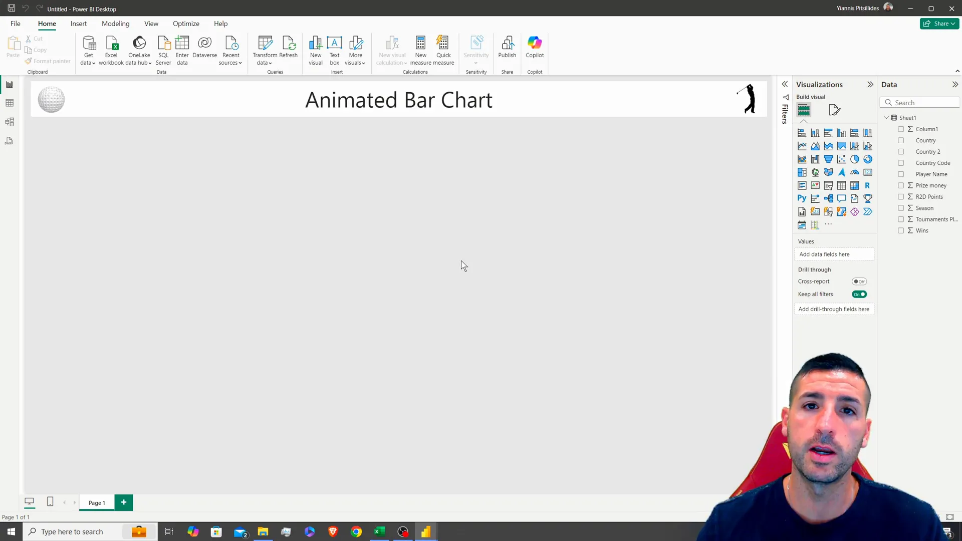
Setting Up the Animated Bar Chart
After you’ve added the animated bar chart to your dashboard interface, in the corner; resize it to 551 by 490 pixels and customize it by including the players name as the category along with wins, as the value and the season as the temporal frame.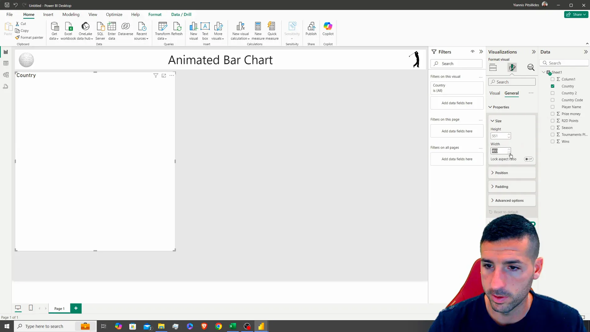
Formatting Your Visuals
Once you’ve arranged your visuals nicely in place and ready to go on the screen display the next step is to make sure they’re clear and visually appealing to the audiences eye! Begin by tweaking the title of the animated bar graph to read “Player Wins, across Seasons.” Make sure to play around with types and colors, for easy reading and visual appeal.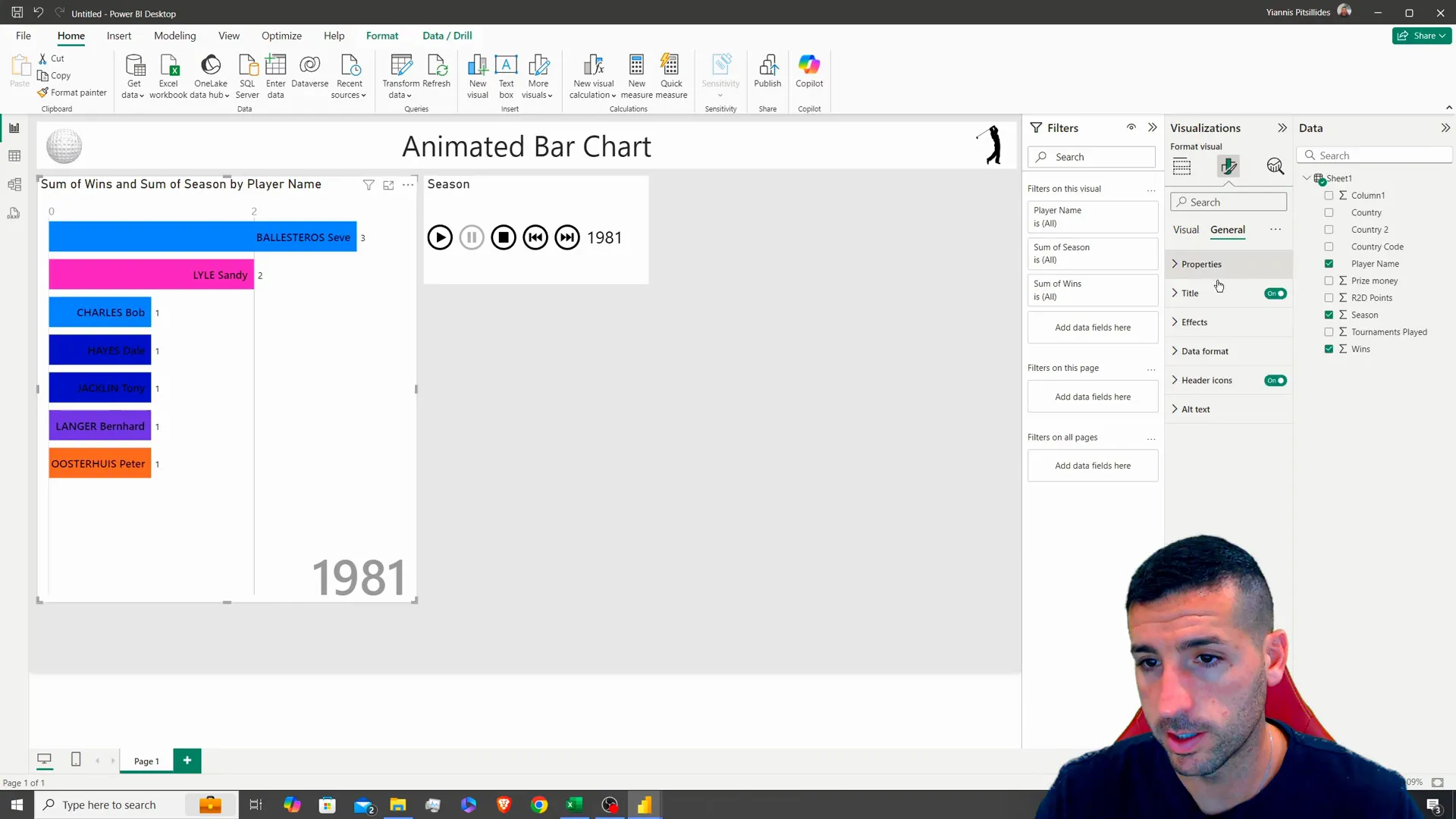
Customizing Play Controls
Up is adding the feature to kick off the animation process by including a visual play button and setting it up to manage the playback of the charts smoothly and effectively This stage is crucial, in facilitating user engagement as it lets them observe how the data evolves over different time periods.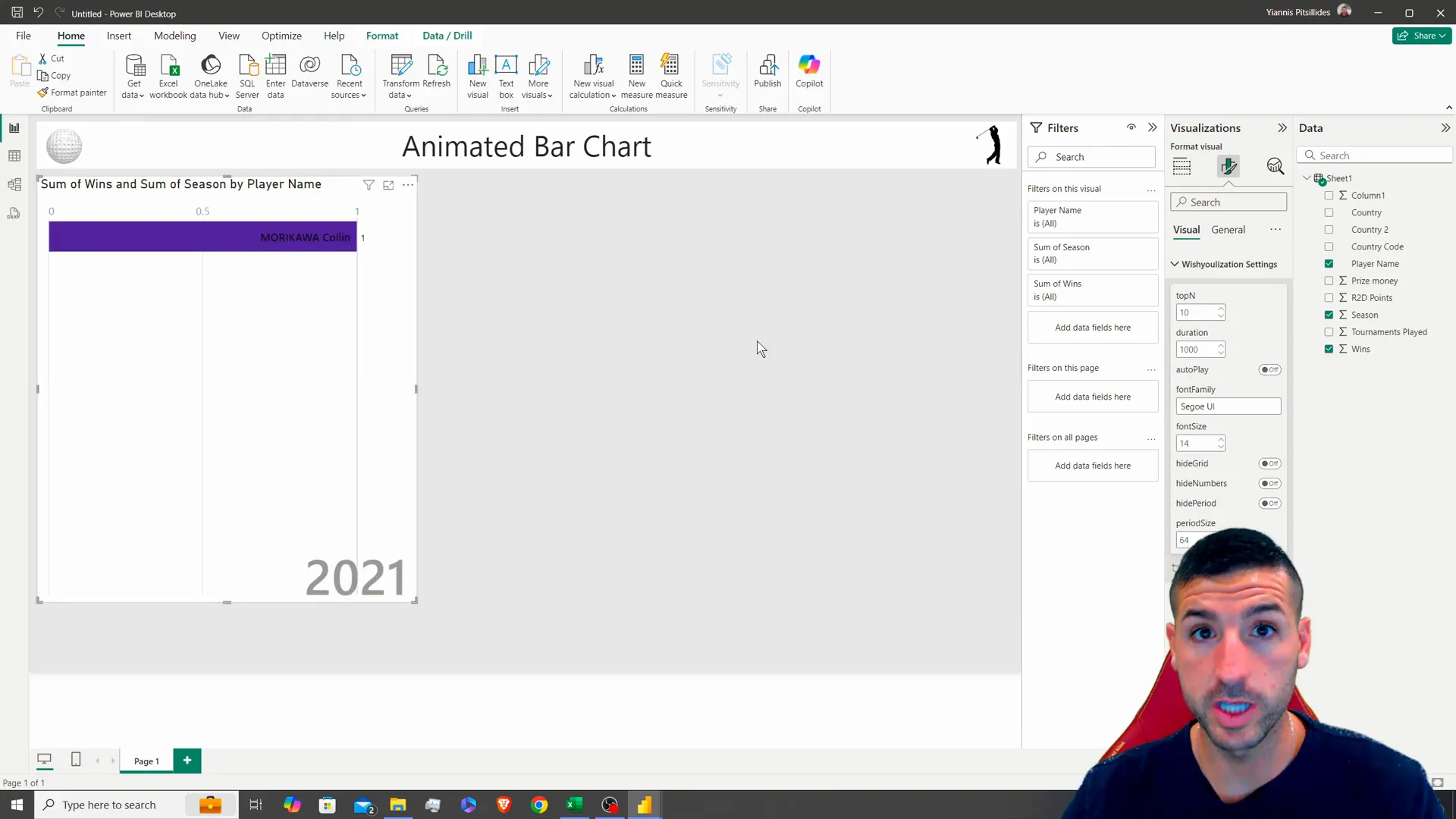
Creating a Detailed Data Table
To give the audience an understanding of the information shared onscreen include a table showing details such, as the season number players name nationality tournaments participated prize earnings and victories transform an existing visual into a tabular layout.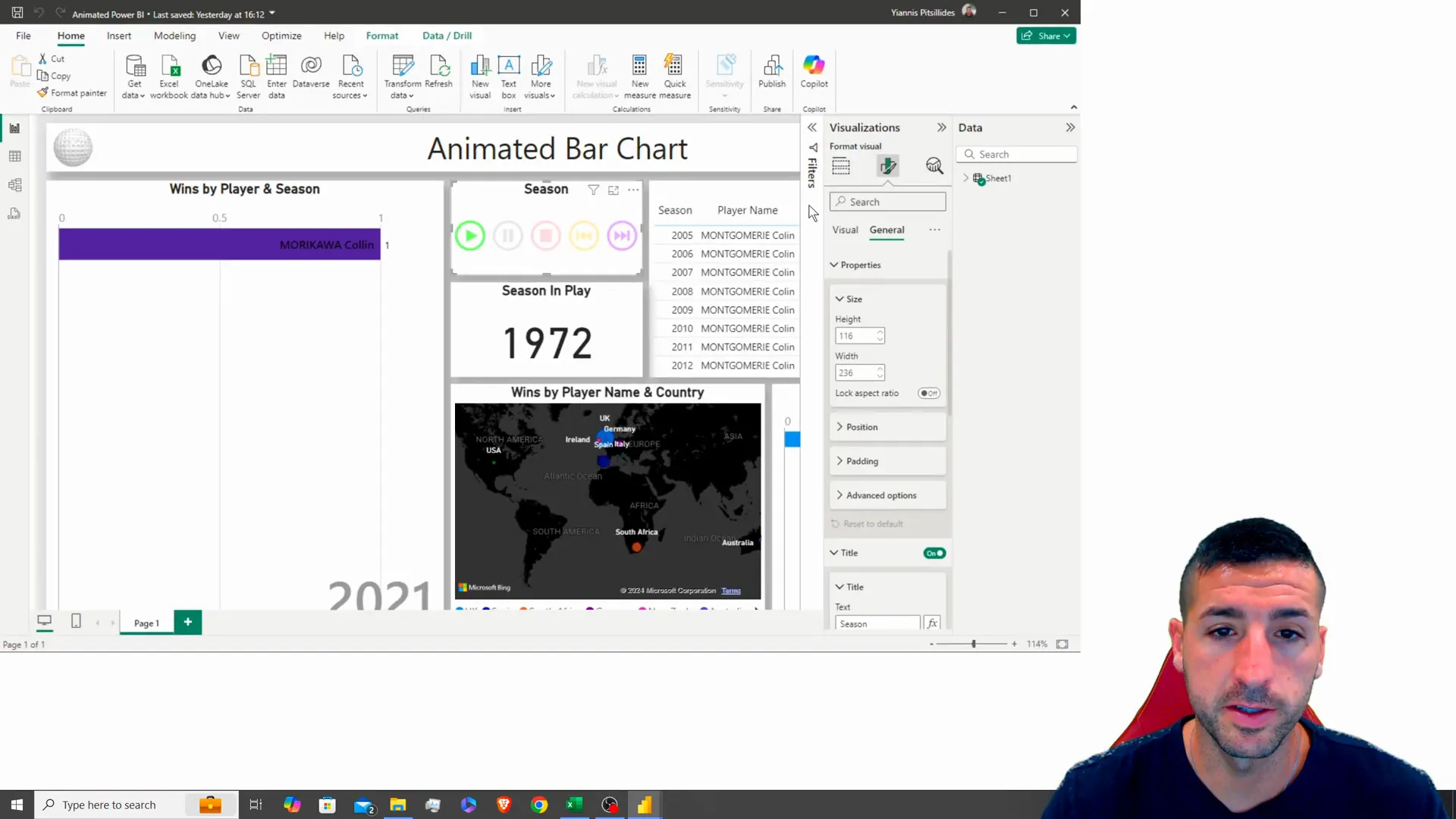
Conditionally Formatting the Table
Improve the clarity of your table by using formatting techniques such, as color coding the wins according to performance metrics. Using red for wins and green, for high wins can make it easier for users to understand the data at a glance.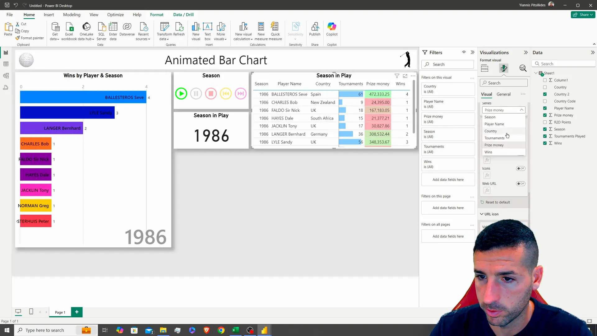
Adding a Map Visualization
Mapping geographical information can be quite impactful, in a sense. To achieve this you could take an existing element. Transform it into a map format. Use the country names as labels on the map. Represent the number of victories, with varying bubble sizes. This approach will effectively showcase how wins are spread out across regions.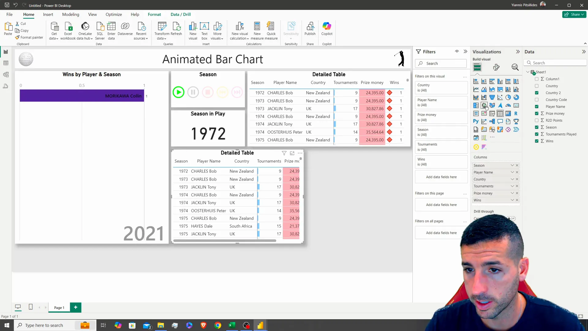
Finalizing the Price Money Visualization
Finally recreate the map graphic to generate a representation of prize money distribution, among players by season with titles like “Player Earnings by Season.” This will offer users information, about the aspects of player performances.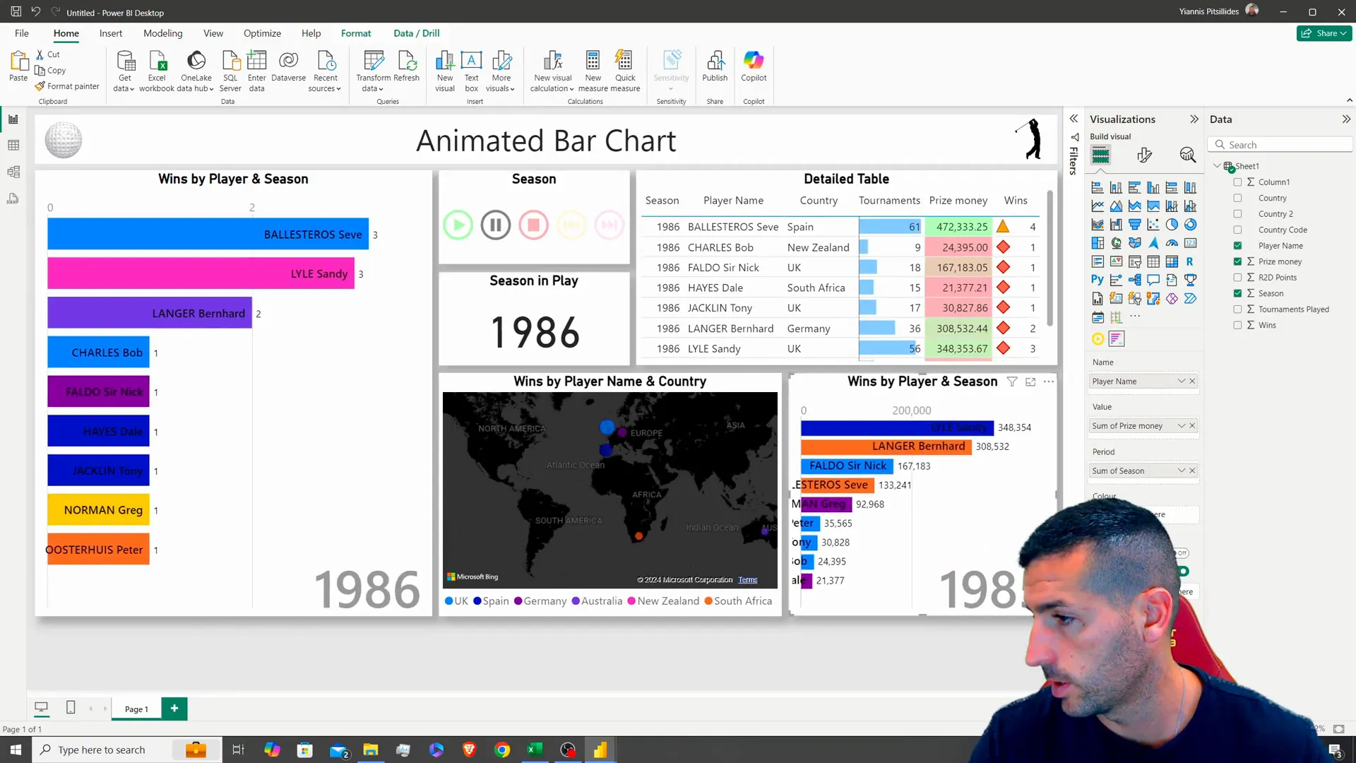
Important Notes on Data Usage
Please ensure that the dashboard is utilized with the play button enabled as it is important considering that the data accumulates over time and static views might not provide a representation of the information.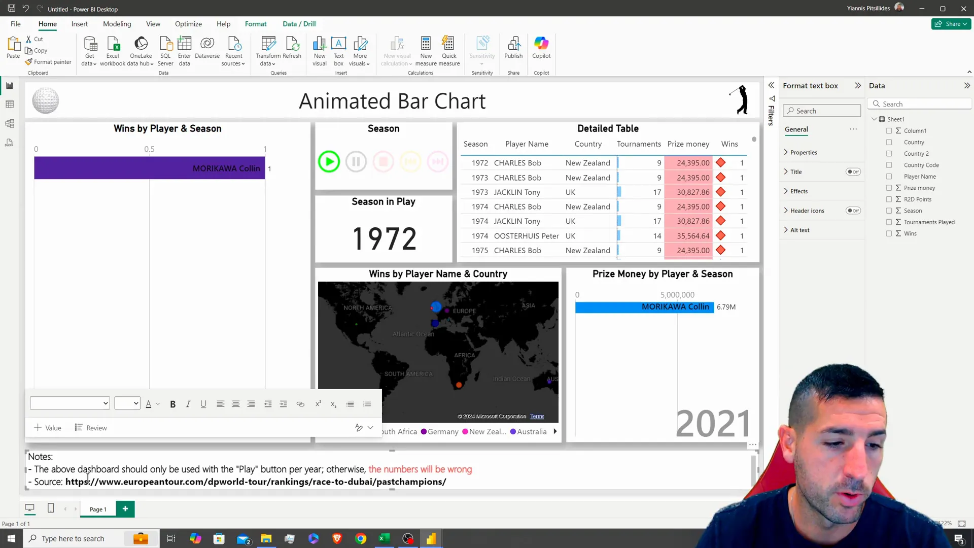
Conclusion
Great job, with your animated Power BI dashboard that effectively displays data in an engaging way for your audience to understand trends and performances better.If you enjoyed this guide and found it useful would appreciate a like,a subscription. Turning notifications, for videos.Feedback and suggestions are always appreciated!
For those interested in experimenting further, you can access the raw data and example files on my GitHub page.
Connect with me on X for more insights and updates!
