Creating a Power BI scorecard dashboard can be quite thrilling as you embark on the journey of turning data from Excel into insights that can drive action forward. Follow along as we guide you through the steps of crafting an insightful scorecard dashboard tailored for a travel agency using Power BI software. If you’re keen to explore the realm of data analytics ready to delve into your Excel data file. Lets begin this adventure together!
Setting Up Your Dashboard Background
To start designing your Power BI scorecard dashboard begin by selecting a background that enhances the look and readability of the dashboard. 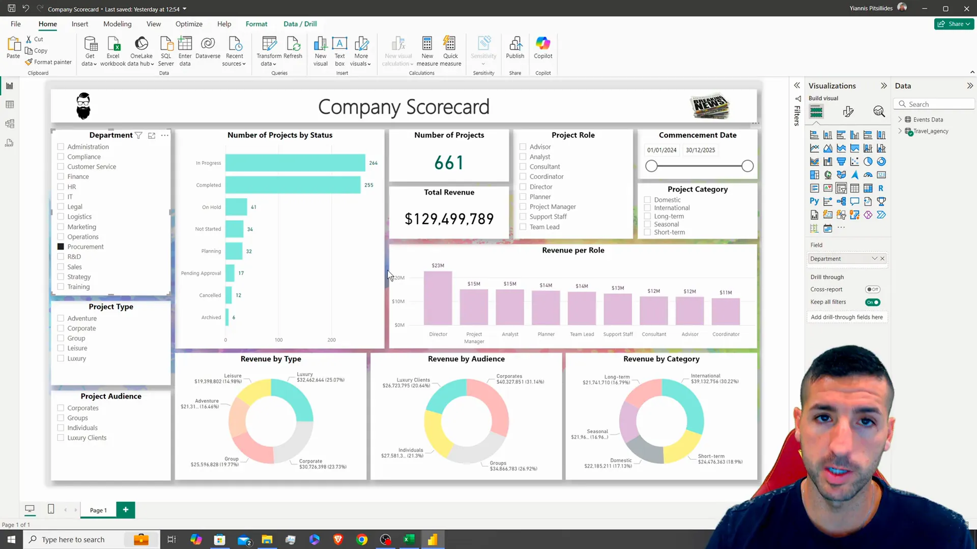
Lets start by adjusting your canvas settings to a size of 850, by 1500 pixels for a look on your dashboard layout. Then select a light gray background shade. Make sure the transparency is at 0%, for display.
Lets change the theme to classic for a appearance that many users prefer to use it extensively. To enhance the appeal of your content better add a background image that complements your data and adjust its size accordingly. For a touch of sophistication layer a rectangle, over the background image, without borders. Set the transparency level to about 24%.
Don’t forget to include your title “Company Scorecard” at the top of the dashboard and make sure to style it with shadows to make it stand out better visually! Consider adding some logos or decorative images in the corners to fill up any areas and give your dashboard a polished look.
Loading Your Data into Power BI
After you’ve got your background sorted out and ready to go in Power BI software program loaded with your data is the step, on the agenda! Head over to the Home tab. Click on “Get Data.” Pick the Excel file that has all your project information, in it. Remember to choose the sheet and double check your data before hitting that “Load” button. 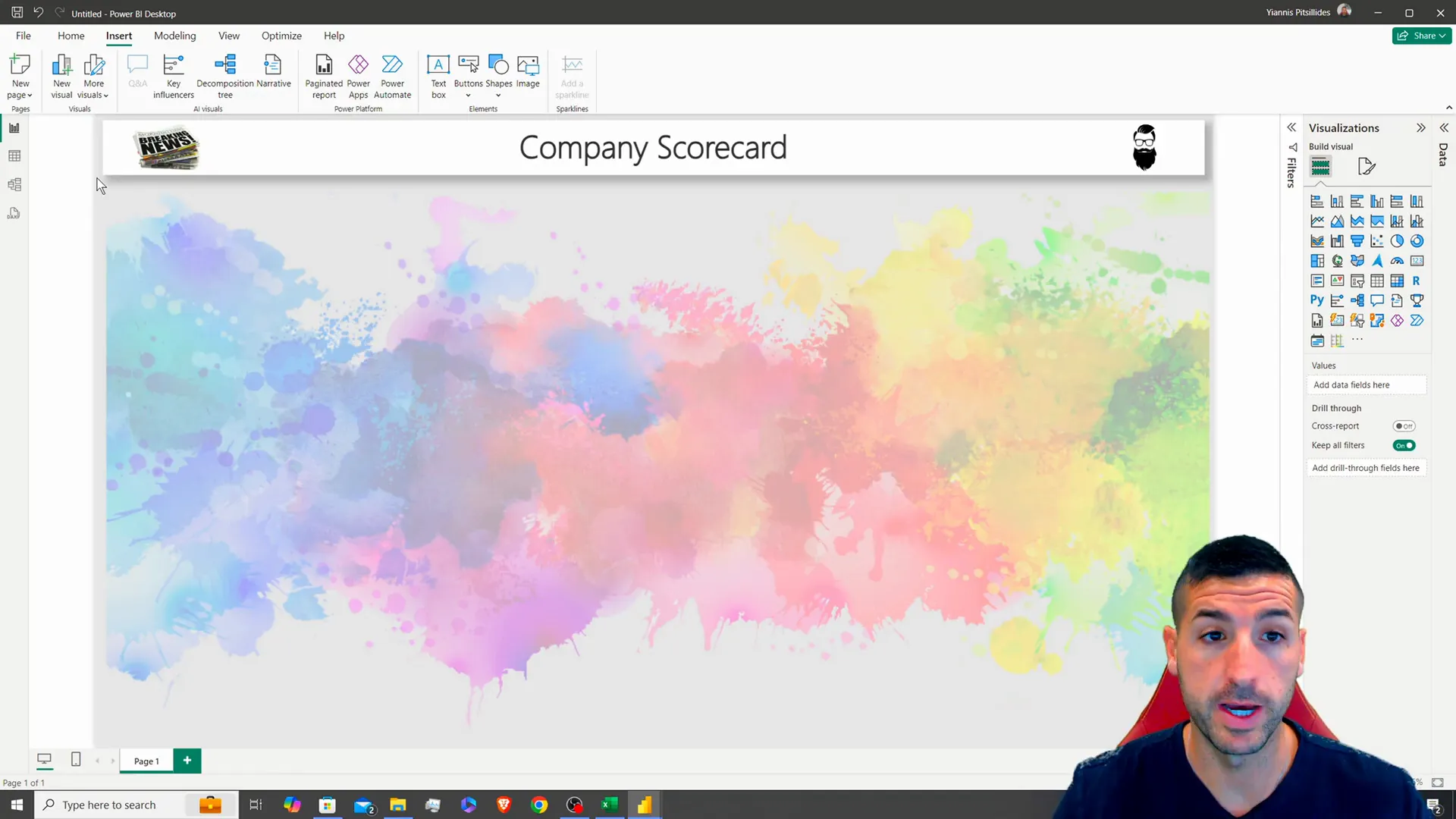
Once you’ve imported the data into your system successfully you should consider changing the table name to “travel_agency” to make it easier to find and manage in your work environment.
Creating Slicers for User Interaction
You need slicers to help users filter and work with the data displayed in your dashboard effectively. Begin by setting up the slicer for the department. Simply drag the department column into the slicer section. After you’ve done that step of adding it in successfully. Get into customizing the slicer settings by taking out the header and putting in a title. Make sure the title stands out by making it bold and centering it properly. 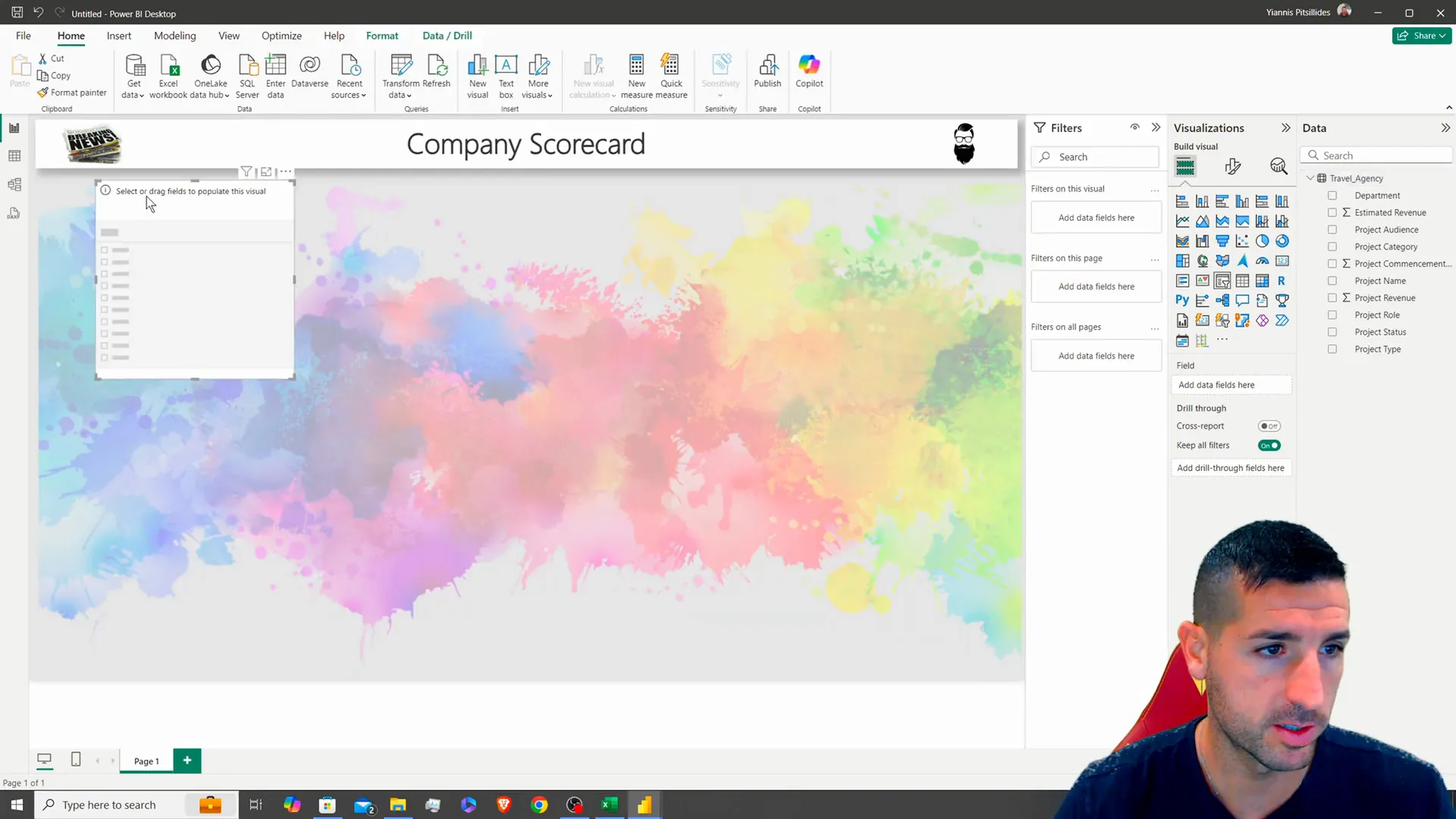
Up is to make some slicers, for different project types and target audiences! Just duplicate the slicer to keep things neat and tidy before updating the data source for each one appropriately. Remember to keep the slicer sizes consistent, for a polished appearance.
Please think about enlarging the text size of the slicer values for visibility and making some padding adjustments to achieve a layout.
Visualizing Project Data
Now that you have configured the slicers accordingly the next step is to generate visuals that accurately depict your data findings. Begin by crafting a bar chart that displays the distribution of projects based on their statuses. Duplicate a existing visual to maintain the style and modify the data attributes to showcase project statuses and the frequency of project names. 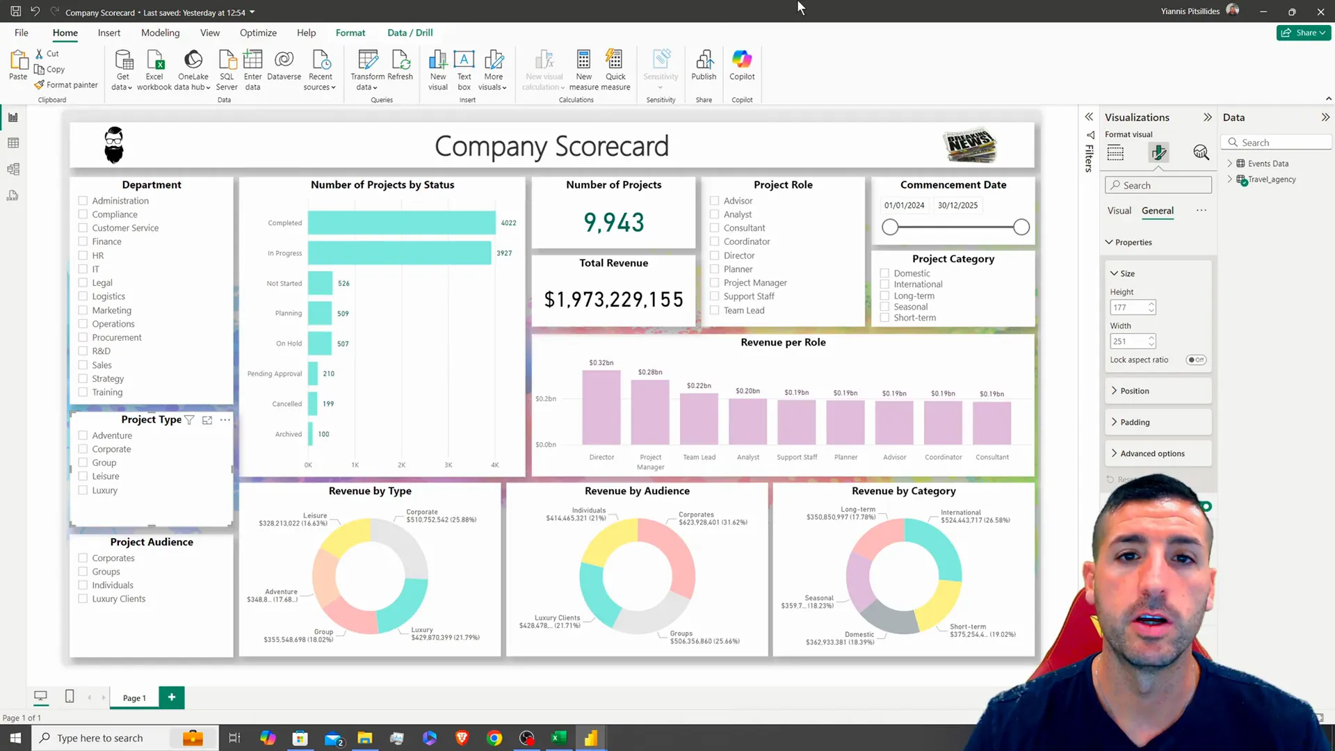
Lets make the charts colors a soft shade of green to ensure that the y axis stands out clearly! Adding data labels can give us insights too. Just remember to turn them on and tweak their color and size for visibility.
Afterwards make cards to showcase metrics such, as the count of projects and total earnings. These cards ought to be noticeable and visually unique thus it’s important to modify their dimensions and design appropriately.
Adding More Interactivity with Additional Slicers
To gain an understanding of the data and enhance your analysis capabilities, on the dashboard;. Include additional filters for project roles and start dates as well as project categories.. Each filter should enable users to refine the information displayed on the dashboard effectively.. When setting up the date filter for project commencement dates in Power Query make sure to adjust the data type to “date”, for options. 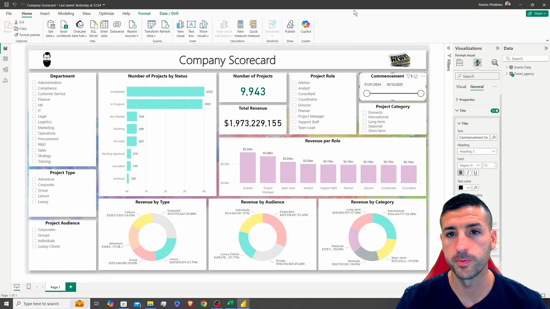
After setting up all the slicers in their positions it is important to test them to make sure they are filtering the visuals accurately. This interactive feature is essential for users to explore insights, from perspectives.
Creating Revenue Visualizations
Lets make a bar chart showing the revenue generated by project roles so that stakeholders can easily see the sources of income from each role in the project team. Use an existing visual, as a template. Adjust the data fields to match this representation. 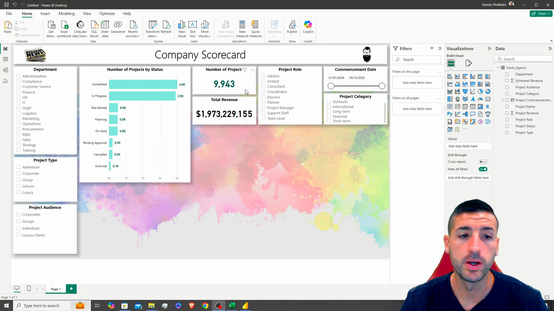
To provide a analysis breakdowns by generating three donut charts showcasing revenue based on type demographics and categories can be effective, in revealing proportions and facilitating comparisons Remember to use light colors when formatting each chart for a visually appealing presentation experience.
Testing and Finalizing Your Dashboard
Once you’ve arranged all the visuals and slicers, in place it’s crucial to check if your dashboard is working properly. Click through each slicer and visual to confirm they update accurately. That the dashboard functions as intended. 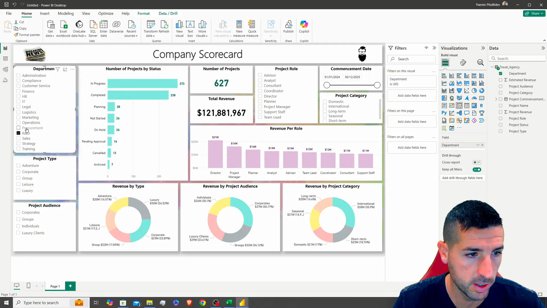
After making sure everything is up and running smoothly take a moment to check out the design. Make sure it’s well balanced, with colors that go together well and that the information is easy to understand. A designed dashboard should not be pleasing, to the eye but should also present data in a clear and effective way.
Conclusion
Job, on creating a top notch Power BI scorecard dashboard for the travel agencys projects; it’s both visually appealing and packed with information. If you found this guide useful and want content, on data analytics and visualization in the future please consider giving this post a like and subscribing.
For those interested in the raw data used in this tutorial, you can find it on my GitHub page. Let’s keep exploring the world of data together!
For more updates and insights, follow me on X.
